Add The Pure Css Tooltips To Your Blog


Add the Css to your blog


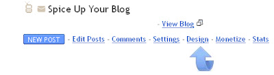
Step 1. In your Blogger dashboard click > Design > Template Designer :


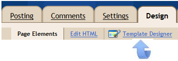
Step 2. In the template designer click > Advanced > Add Css > :


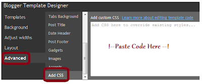
Step 3. Copy and paste the following code into the section with 'Paste Code Here' in image above :

.tooltip
{
position: relative;
background: #eaeaea;
cursor: help;
display: inline-block;
text-decoration: none;
color: #222;
outline: none;
}

.tooltip span
{
visibility: hidden;
position: absolute;
bottom: 30px;
left: 50%;
z-index: 999;
width: 230px;
margin-left: -127px;
padding: 10px;
border: 2px solid #ccc;
opacity: .9;
background-color: #ddd;
background-image: -webkit-linear-gradient(rgba(255,255,255,.5), rgba(255,255,255,0));
background-image: -moz-linear-gradient(rgba(255,255,255,.5), rgba(255,255,255,0));
background-image: -ms-linear-gradient(rgba(255,255,255,.5), rgba(255,255,255,0));
background-image: -o-linear-gradient(rgba(255,255,255,.5), rgba(255,255,255,0));
background-image: linear-gradient(rgba(255,255,255,.5), rgba(255,255,255,0));
-moz-border-radius: 4px;
border-radius: 4px;
-moz-box-shadow: 0 1px 2px rgba(0,0,0,.4), 0 1px 0 rgba(255,255,255,.5) inset;
-webkit-box-shadow: 0 1px 2px rgba(0,0,0,.4), 0 1px 0 rgba(255,255,255,.5) inset;
box-shadow: 0 1px 2px rgba(0,0,0,.4), 0 1px 0 rgba(255,255,255,.5) inset;
text-shadow: 0 1px 0 rgba(255,255,255,.4);
}

.tooltip:hover
{
border: 0; /* IE6 fix */
}

.tooltip:hover span
{
visibility: visible;
}

.tooltip span:before,
.tooltip span:after
{
content: "";
position: absolute;
z-index: 1000;
bottom: -7px;
left: 50%;
margin-left: -8px;
border-top: 8px solid #ddd;
border-left: 8px solid transparent;
border-right: 8px solid transparent;
border-bottom: 0;
}

.tooltip span:before
{
border-top-color: #ccc;
bottom: -8px;
}

Note - The highlighted sections are the colors of the tooltips and can be changed to suit your blog.See some color options here - Color Chart.

Step 4. Click apply to blog in the top right of your screen to save, we now have the Css in place to create the tooltip next we will see how to add the tool tip to text.

Adding the tooltip to text


When writing a post and you want to add a tool tip to some text you do it as shown below :

<a href="#" class="tooltip">
The Text That Will Have A Tooltip
<span>The Actual Description That Appears On Hover</span>
</a>

So on the demo page you seen the first tooltip is coded like this :

<a href="#" class="tooltip">Phasellus fermentum <span>This is the tooltip description</span></a>


Comments

Popular posts from this blog

16 Best Free Blogger Templates Featuring Amazing JQuery Featured Slideshows

Add A YouTube Subscribe To Channel Gadget To Your Blog