Beautiful Animated Hover Effect Captions For Images On Blogger
In this post we have not only an amazing effect you can add to the images you use in your blog posts but it's amazingly simple and amazingly fast so wont slow down you page load time.The effect is similar to what you will see on many Featured Posts Gadgets, when you hover your cursor over the image a caption scrolls up from the bottom with your selected text.
So, you can have the title of the image, a description, date taken, credit or anything you like.The code we will use has No Javascript this ensures it will load fast and as i said not slow down your blog.The code is all Css3 (Don't Worry I Will Keep It Simple) so you have a flowing and transparent effect with the caption.There is also a stylish Shadow edge around the image On-Hover.
So, you can have the title of the image, a description, date taken, credit or anything you like.The code we will use has No Javascript this ensures it will load fast and as i said not slow down your blog.The code is all Css3 (Don't Worry I Will Keep It Simple) so you have a flowing and transparent effect with the caption.There is also a stylish Shadow edge around the image On-Hover.
Just show us the demo and screenshot so we can see for ourselves i here you shout !
OK But, Before i show you the demo you should note while this image caption will work with all browsers older versions of Internet Explorer will not have the fluid style or transparency.Internet Explorer 9 does a better job and it works perfect in Firefox and Chrome.
Live Demo - Animated Hover Effect Image Caption
Screenshot

Use Hover Effect Image Captions On Your Blog
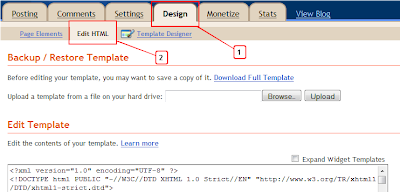
Step 1. In Your Blogger Dashboard Click > Design > Edit Html

Step 2. Find the following piece of code in your blogs Html : (Click Ctrl and F for a search bar to help find the code - More Info)
Step 3. Copy And Paste The Following Code Directly Above / Before ]]></b:skin>
Scroll Box - Make Sure Your Get All the Code
<!--Start Image Caption Css-->
#image-hover {
}
#figure {
position:relative;
float:left;
margin:10px;
overflow:hidden;
padding: 1px;
}
#figure:hover {
-moz-box-shadow:0 0 20px rgba(0,0,0,0.75);
-webkit-box-shadow:0 0 20px rgba(0,0,0,0.75);
box-shadow:0 0 20px rgba(0,0,0,0.75);
}
#figure .caption {
position:absolute;
bottom:0;
left:0;
opacity: 0.75;
margin-bottom:-115px;
-webkit-transition: margin-bottom;
-webkit-transition-duration: 400ms;
-webkit-transition-timing-function: ease-out;
-moz-transition-property: margin-bottom;
-moz-transition-duration: 400ms;
-moz-transition-timing-function: ease-out;
-o-transition-property: margin-bottom;
-o-transition-duration: 400ms;
transition: margin-bottom;
transition-duration: 400ms;
transition-timing-function: ease-out;
}
#figure:hover .caption {
margin-bottom:0px;
}
#image-hover .caption {
width:100%;
height:90px;
padding:10px;
background:#111;
color:#fff;
font-family: Arial, Helvetica, sans-serif;
}
#image-hover .caption b {
text-shadow: 0px 2px 0px #000;
}
#image-hover .caption {
color: #ddd;
line-height: 24px;
font-size: 14px;
text-shadow: 0px 2px 0px #000;
}
<!--End Image Caption Css, Info : http://www.spiceupyourblog.com -->
Code Credits - Blogger Bits#image-hover {
}
#figure {
position:relative;
float:left;
margin:10px;
overflow:hidden;
padding: 1px;
}
#figure:hover {
-moz-box-shadow:0 0 20px rgba(0,0,0,0.75);
-webkit-box-shadow:0 0 20px rgba(0,0,0,0.75);
box-shadow:0 0 20px rgba(0,0,0,0.75);
}
#figure .caption {
position:absolute;
bottom:0;
left:0;
opacity: 0.75;
margin-bottom:-115px;
-webkit-transition: margin-bottom;
-webkit-transition-duration: 400ms;
-webkit-transition-timing-function: ease-out;
-moz-transition-property: margin-bottom;
-moz-transition-duration: 400ms;
-moz-transition-timing-function: ease-out;
-o-transition-property: margin-bottom;
-o-transition-duration: 400ms;
transition: margin-bottom;
transition-duration: 400ms;
transition-timing-function: ease-out;
}
#figure:hover .caption {
margin-bottom:0px;
}
#image-hover .caption {
width:100%;
height:90px;
padding:10px;
background:#111;
color:#fff;
font-family: Arial, Helvetica, sans-serif;
}
#image-hover .caption b {
text-shadow: 0px 2px 0px #000;
}
#image-hover .caption {
color: #ddd;
line-height: 24px;
font-size: 14px;
text-shadow: 0px 2px 0px #000;
}
<!--End Image Caption Css, Info : http://www.spiceupyourblog.com -->
That's the Css code to create the effect added to your template, The next step is the image itself.
When you want to use this effect on an image in a post copy the code below, paste it into your post and then add your image URL and text as shown.
Important
You will need to add your image URL and text as shown Below :
IMAGE-URL-HERE : Replace With The URL Of The image You Want To Use.
Title Here : Replace With An Image Title Or Other Text.
Description Here : Replace With An Image Description Or Other Text.
How To Get Your Image URL
I try to leave no one behind so if your a complete newbie you may ask 'How Do I Get The Image URL ?'.
OK, basically upload your image to blogger as usual, in the HTML view of your post editor your image code will look something like this :
The actual image URL is the part in red, if your still having trouble drop a comment.
That another great Blogger Image Tutorial with a very cool effect, make sure to check out more of our Image Tips and Blogger Gadgets.
Drop your Comments and Questions Below.


Hello and first of all thank you for your tutorial, I have applied your teachings but still have problems with the borders in the image
ReplyDeletehttp://milhojasecopapeleria.blogspot.com.es/
how can I remove the borders of the image? thank you very much
Hello,Pls Restore the html setting?thanx to very much for apply these setting
Delete